Hi, I'm Águilis!
I’m a UI/UX designer at GoGood, crafting seamless wellness experiences for users across Brazil. Passionate about inclusive design, I create solutions that empower and inspire. From scratch to refinement, I turn ideas into impactful user-centred products
GoGood Website
Redesigned the website and realigned the brand with a new positioning strategy, enhancing user experience and strengthening brand identity
GoGood App
Enhanced user empowerment with intuitive plan control features
GoGood Partners
Redesigned the platform to streamline workflows and boost efficiency for managers
Hi, I'm Águilis 👋🏼
I am a University of Brasília (UnB) alumni and a Brazil-based multidisciplinary UI/UX designer with strong visual skills and a background in Visual Programming. My career passion is to create inclusive digital products that empower people.
Currently, I lead UI/UX projects in GoGood’s tech team.Born in Brazil, my design journey began with my Visual Programming bachelor’s degree at the University of Brasília, where I discovered UX and UI design. I collaborated with social institutions and led innovative, user-centred design concepts. Since then, I’ve continued to deepen my expertise in product design through hands-on experience and practical application.
My skills / Toolset
UI/UX and graphic tools:
Analytics:
UX frameworks & Skills:
Additional skills:
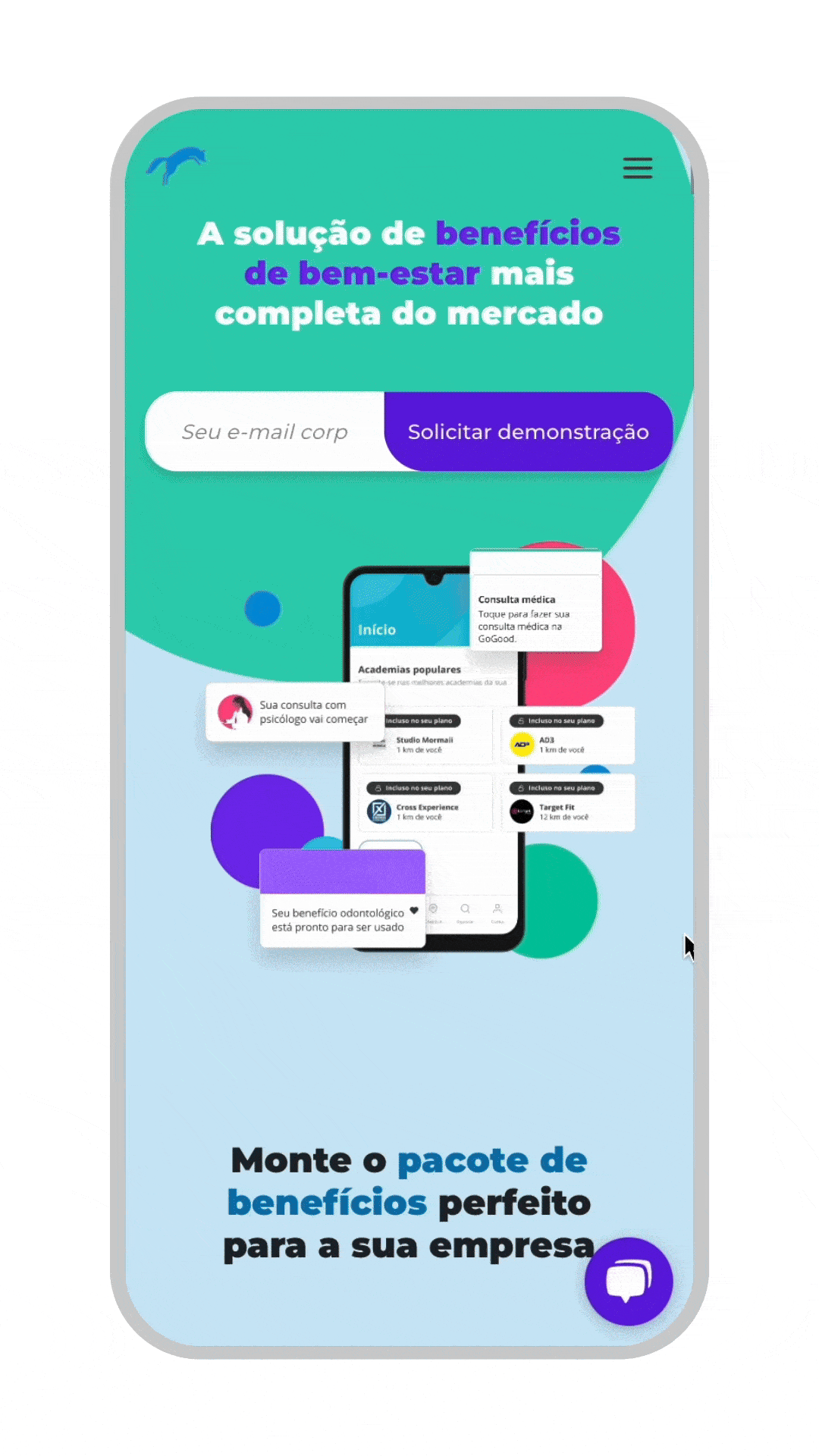
GoGood Website
Redesigning GoGood’s Website for a Broader Vision. Expanding from fitness to a holistic wellbeing platform with a fresh identity and user-centric design
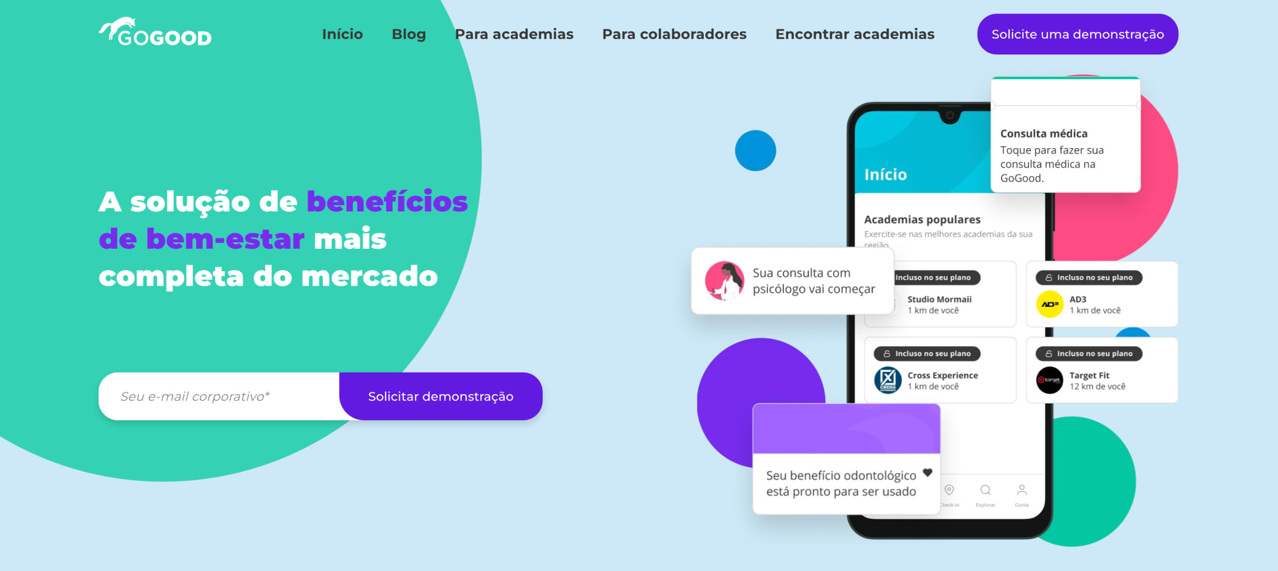
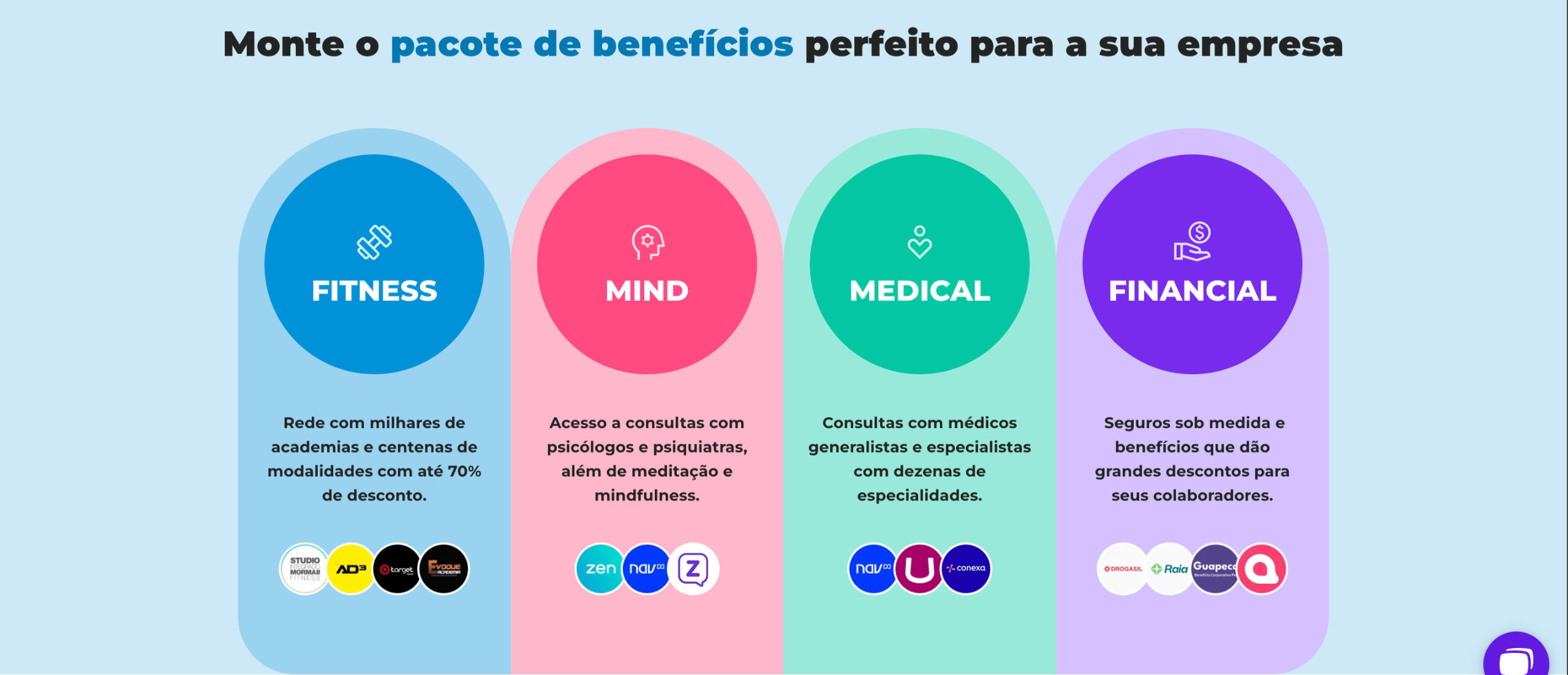
Led the redesign of GoGood’s website, transforming it from a fitness-focused platform to a holistic wellbeing SaaS with four pillars: financial, medical, fitness, and mind. The new site delivers a mature, user-friendly experience, driving more leads and improved brand perception
Problem Statement
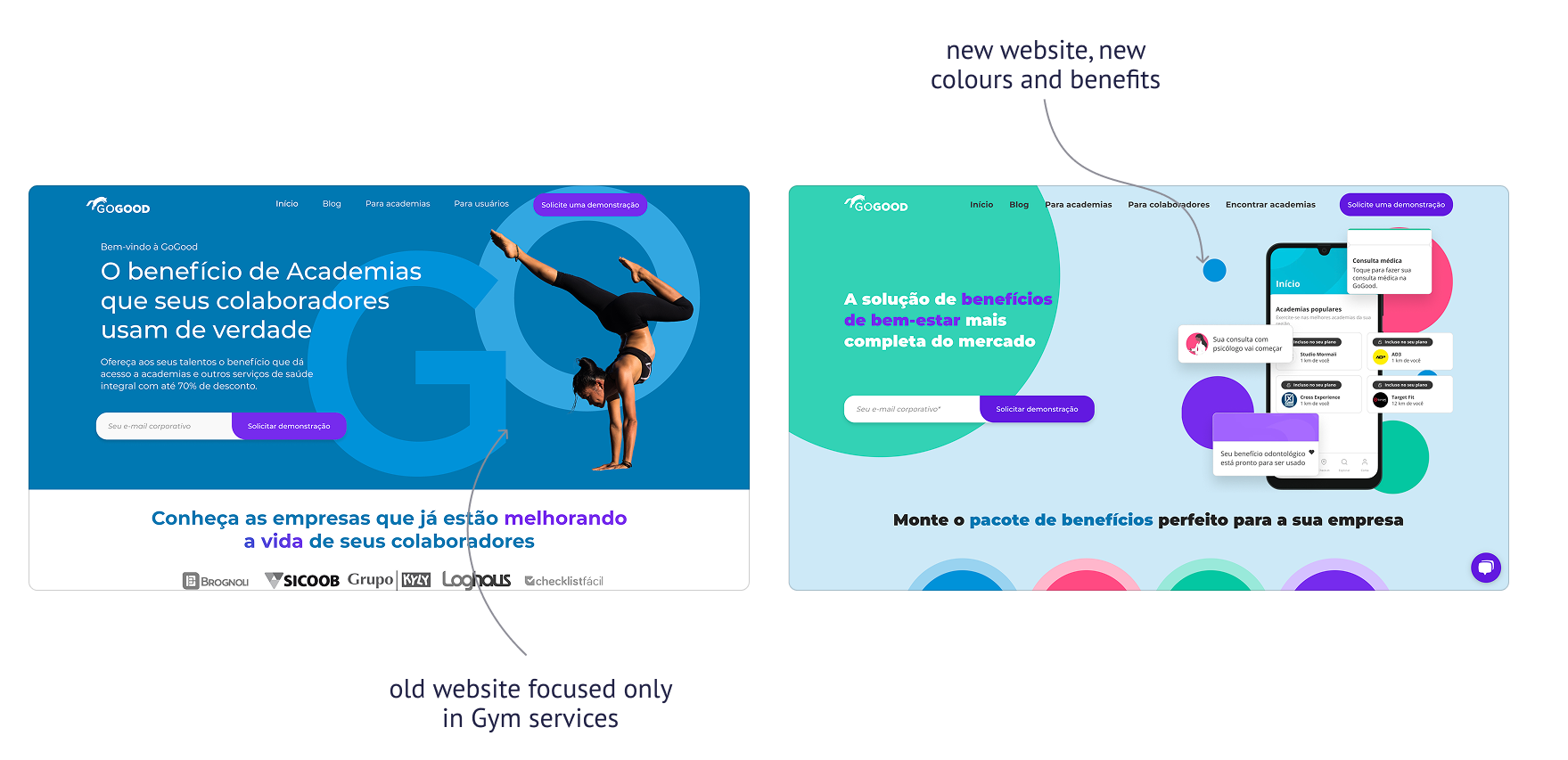
The old website focused solely on fitness, which no longer aligned with the company’s expanded vision. Users struggled to understand the full range of offerings, and the outdated design failed to reflect the company’s maturity. The goal was to create a website that communicated the new positioning clearly, improved user engagement, and supported business growth.

My Role
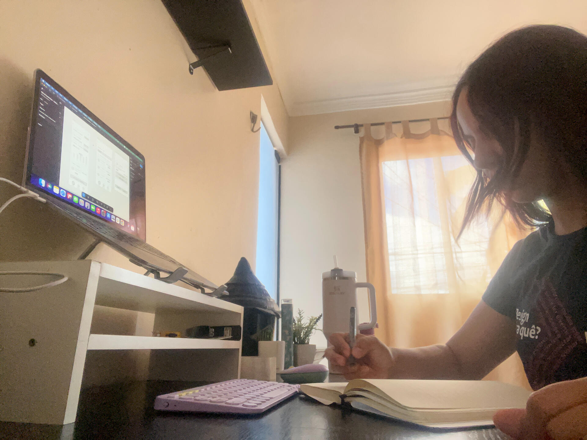
As the main designer, I owned the end-to-end design process, from research and ideation to prototyping and testing. I collaborated closely with developers and stakeholders to ensure the platform was both functional and user-friendly.
Process
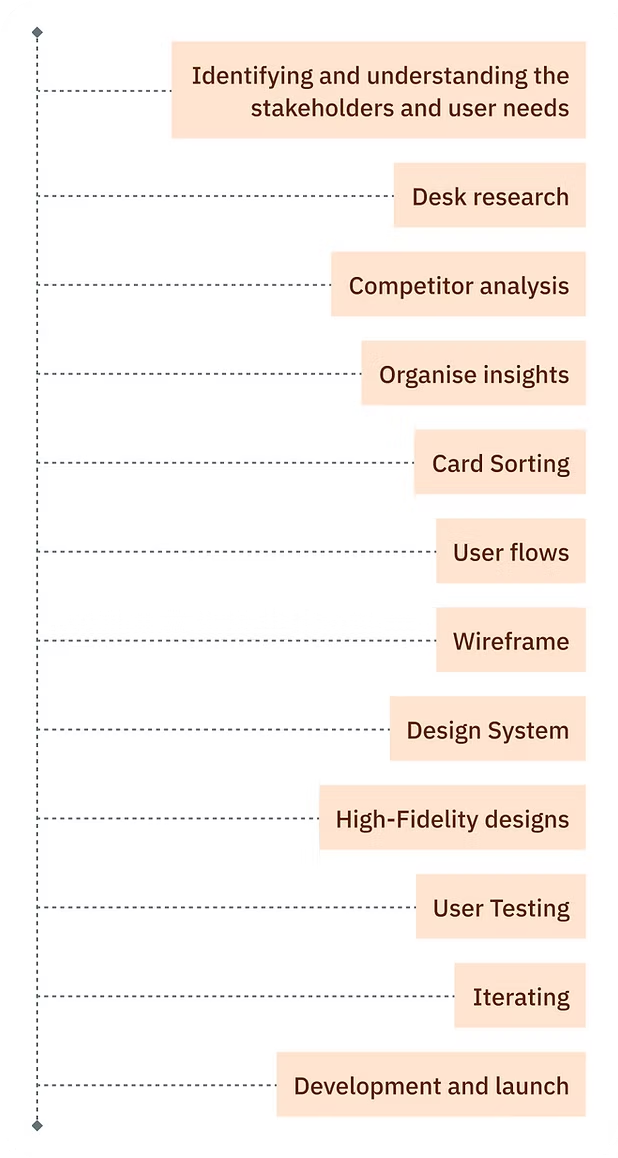
Discovery
• Analysed user behaviour and conducted competitor analysis to identify pain points and opportunities.Ideation
• Worked with leaders to define the four pillars (financial, medical, fitness, mind) and how they’d be represented on the site.Design
• Redesigned the website architecture, created wireframes and prototypes, and developed a new tone of voice to reflect the company’s mature, holistic positioning.Testing
• Conducted usability tests and iterated based on feedback.Outcome
• Delivered a website that clearly communicated the new positioning and improved user engagement.

Visuals
The homepage highlights GoGood’s four pillars with clear CTAs, creating a modern and engaging first impression
Each product page showcases the features and benefits of its pillar, providing clear, actionable information
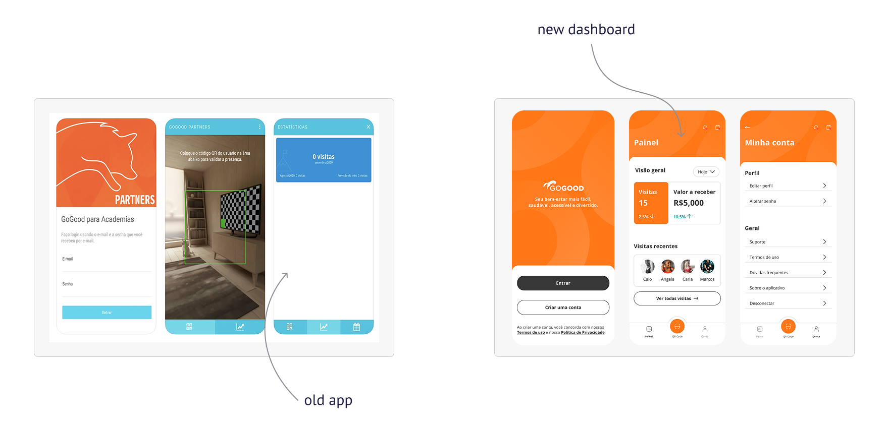
The comparison shows the shift from a fitness-only site to a holistic platform, highlighting the redesign’s impact
Results
The new website helped the company achieve:•Increased leads: More users signing up for the platform.•Improved brand perception: A more mature and professional image.•Better user understanding: Visitors can now easily navigate and understand the company’s products and services.
Reflections
This project was a great opportunity to align the company's digital presence with its expanded vision. By focusing on user needs and business goals, we created a website that not only looks modern, but also generates results. If I were to revisit this project, I would explore more personalised user journeys based on individual well-being goals.
Check my other projects
GoGood App
Revamping and creating new features to help users access health benefits more fully
GoGood App is a platform designed to make health benefits more accessible and enjoyable for users. As the lead Product Designer (UI/UX), I revamped the app and introduced new features that simplified plan management, automated tasks, and improved user satisfaction.
Problem Statement
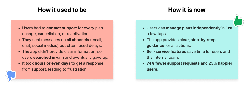
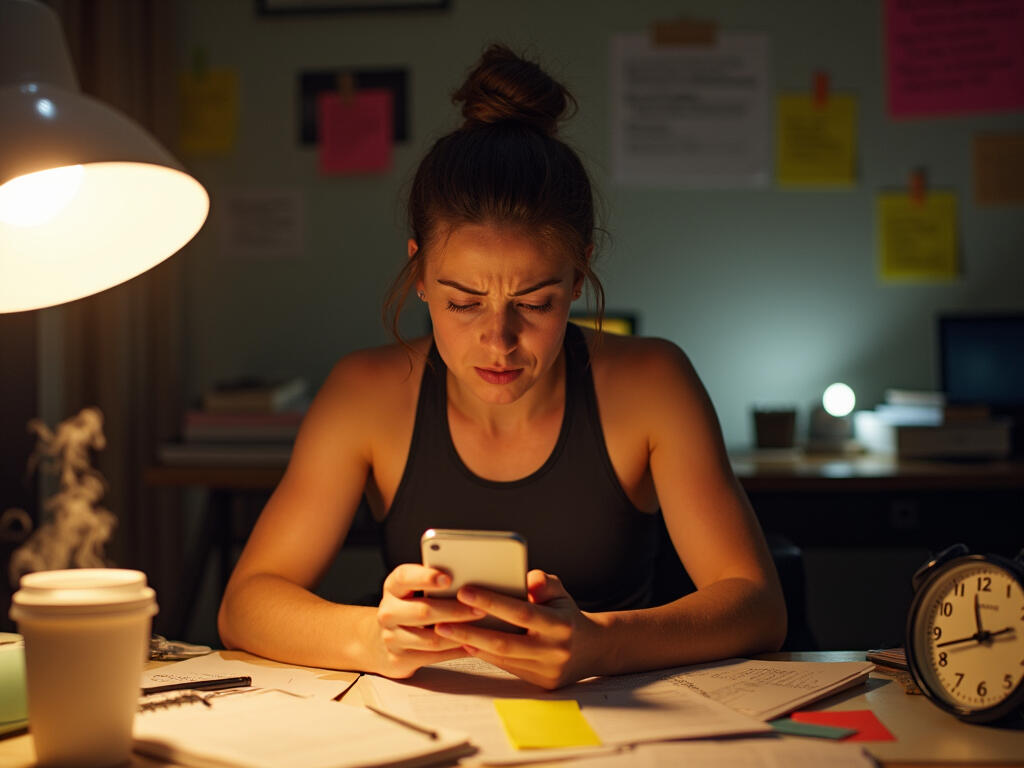
Users faced friction when managing their plans—changes, cancellations, and suspensions required contacting support, creating delays and dissatisfaction. The internal team was overwhelmed with manual tasks, leading to inefficiencies. The goal was to streamline these processes and empower users to manage their plans independently

My Role
As the main designer, I owned the end-to-end design process, from research and ideation to prototyping and testing. I collaborated closely with developers and stakeholders to ensure the platform was both functional and user-friendly.
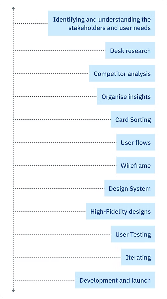
Process
Discovery
• Conducted surveys and meetings with support teams to identify pain points.
• Analysed competitors and organised insights through card sorting with users and the internal team.Design
• Updated the design system and created wireframes and prototypes in Figma.
• Focused on user flows, ensuring each step was intuitive and efficient.Testing
• Conducted usability tests to validate designs and iterated based on feedback.Outcome
• Delivered features that automated tasks, reduced manual workload, and improved user satisfaction.
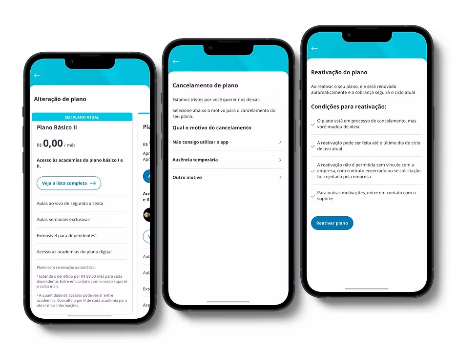
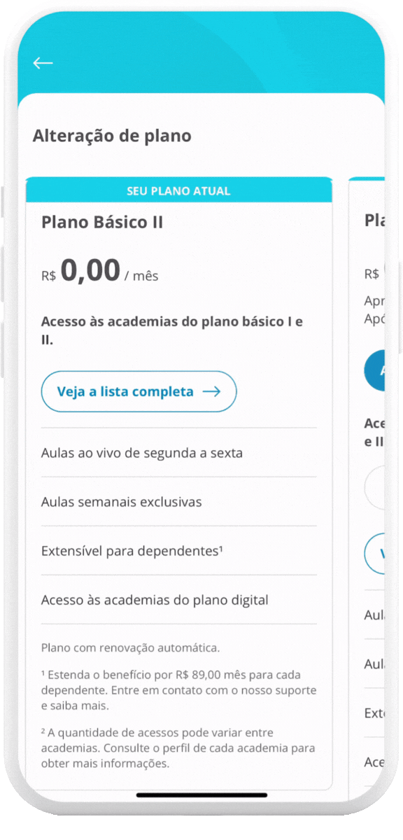
Plan Alteration
Empowered users to choose and switch plans effortlessly, with clear comparisons of costs and benefits. This reduced confusion and increased upsell opportunities by 23%
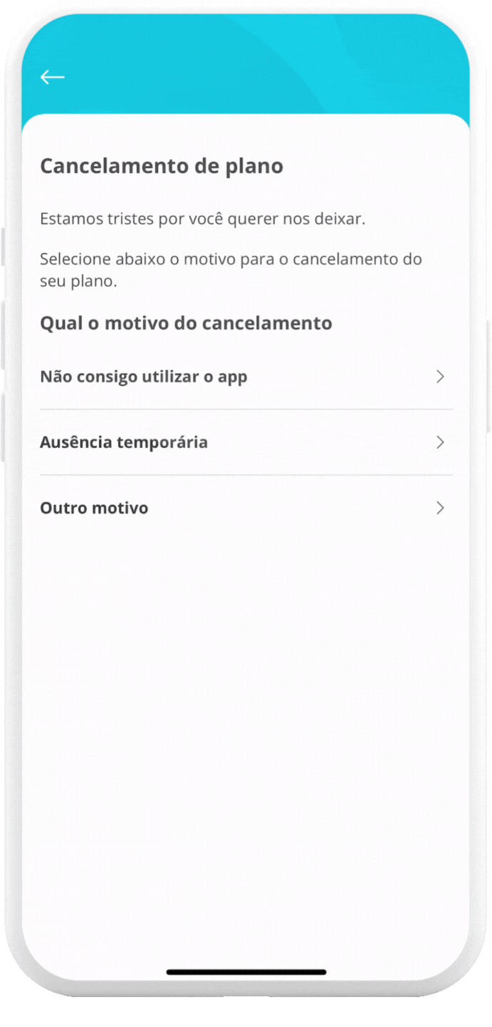
Plan Cancellation
Simplified the cancellation process, offering solutions to common issues before users cancel. This turned potential frustrations into positive experiences, reducing support requests by 74%
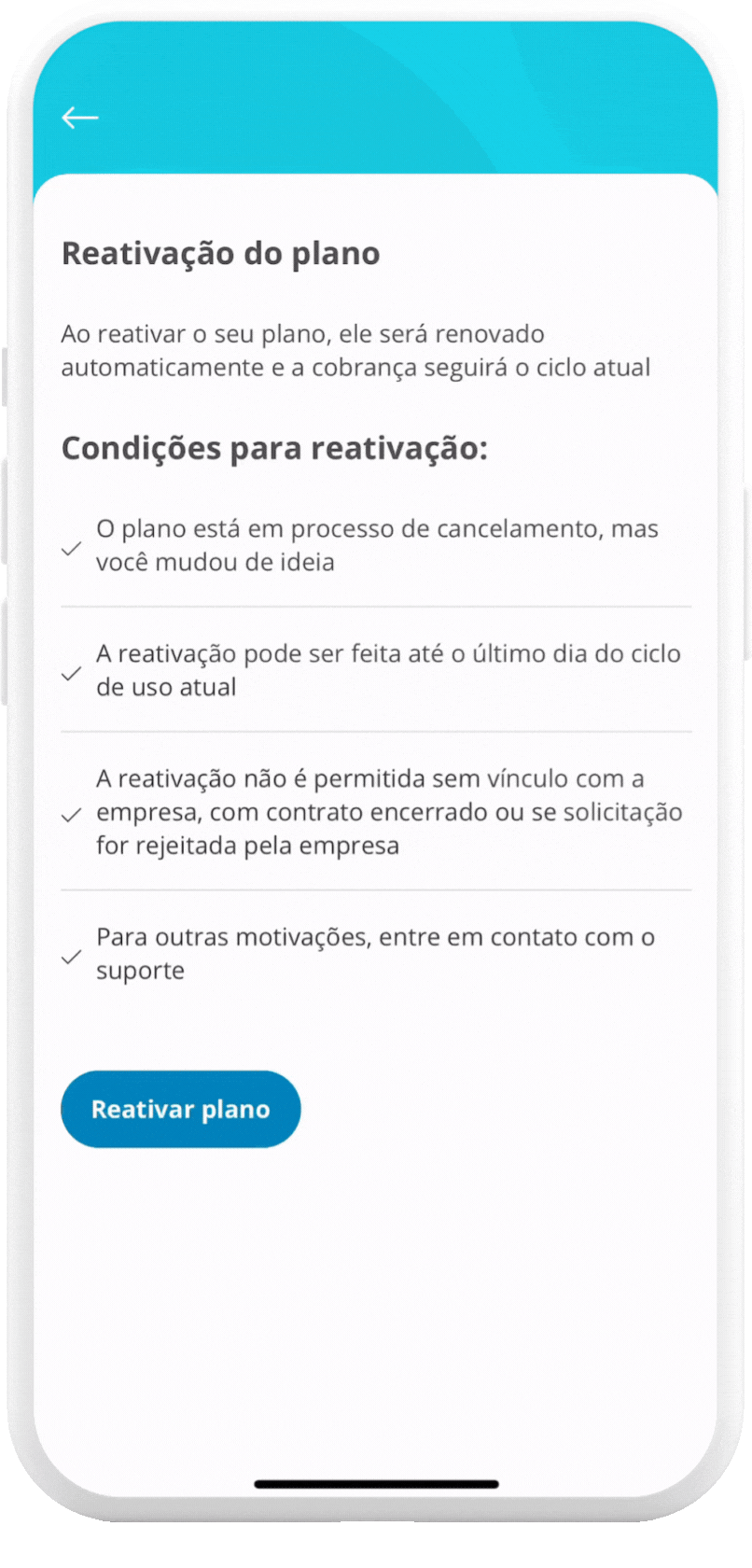
Plan Reactivation
Made reactivation quick and seamless for users who recently cancelled, encouraging them to return. This feature helped retain users and improved overall satisfaction
Results
The redesign led to a 74% decrease in support requests and a 23% increase in upsell plans. Key results include:
•Streamlined plan management: Users can now change, suspend, or cancel plans without contacting support.
•Automated workflows: Reduced manual workload for the internal team.
•Improved user satisfaction: Simplified processes led to happier users and increased loyalty.
Reflections
This project was particularly rewarding because it improved both user experience and business outcomes. By simplifying plan management, we turned potential negative experiences (like cancellations) into opportunities for future returns. If I were to revisit this, I’d explore predictive analytics to further personalise user journeys
Check my other projects
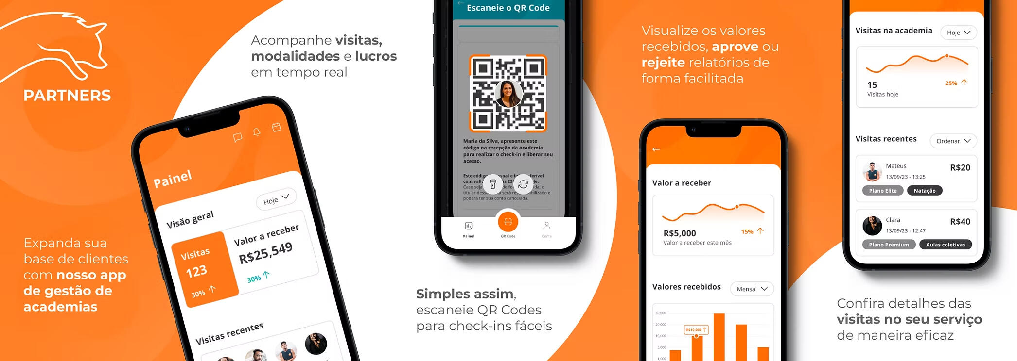
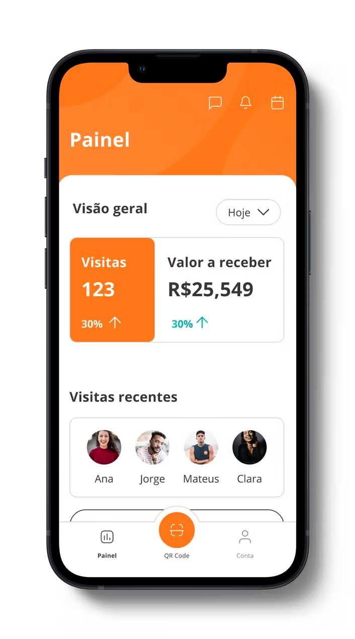
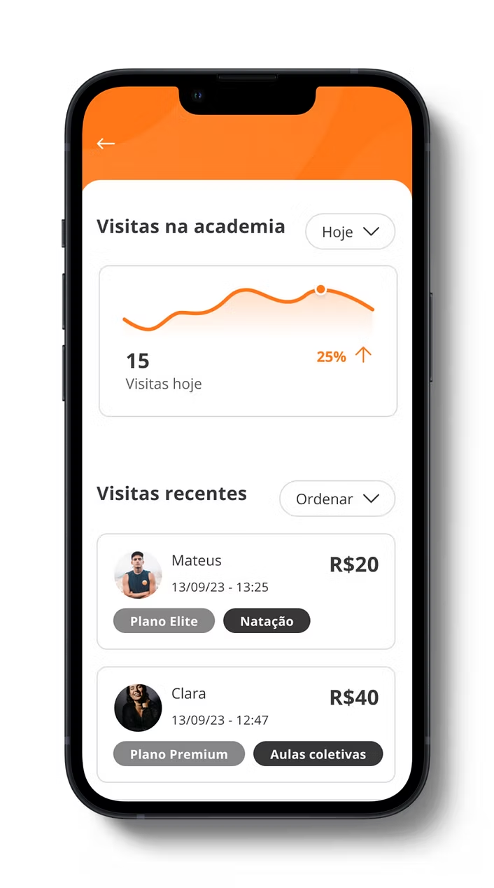
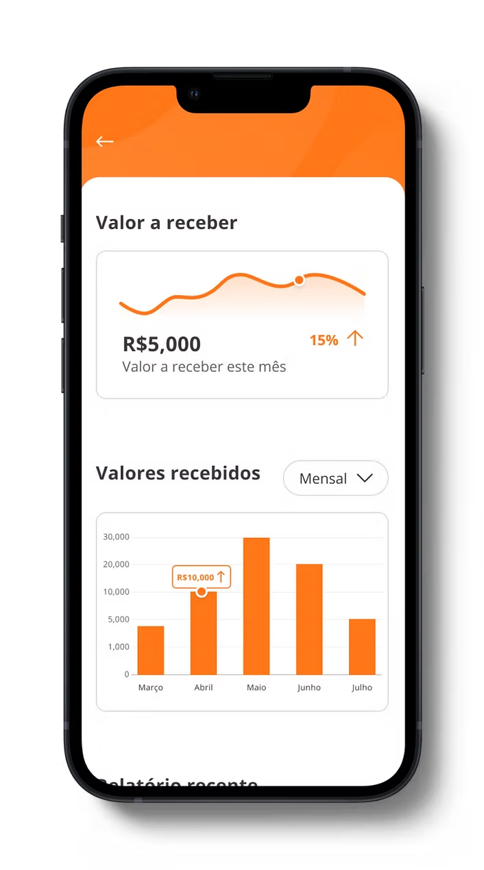
Partners evolved from a simple check-in reader into a powerful analytics platform for gyms.The revamp introduced features to track member visits, analyse trends, and understand business performance, empowering gym owners to make data-driven decisions.
Problem Statement
The original app efficiently managed check-ins, but it didn't have the tools that gym owners needed to understand the performance of their business. They wanted insights into member behaviour, visit trends and revenue, but the app only provided basic access tracking. Partners was redesigned to provide these insights

My Role
As the main designer, I owned the end-to-end design process, from research and ideation to prototyping and testing. I collaborated closely with developers and stakeholders to ensure the platform was both functional and user-friendly.
Process
Research: Interviewed gym owners to identify pain points and desired features.
Ideation: Sketched concepts for dashboards, data visualisation, and reporting tools.
Design: Created high-fidelity prototypes in Figma.
Testing: Conducted usability tests with gym owners.
Outcome: Delivered a platform that provided actionable insights into member behaviour and business performance.

Results
Gym owners reported a 60% improvement in their ability to track member visits and analyse business performance. The new features helped them identify trends, optimise pricing, and improve member retention.
Results
Gym owners reported a 60% improvement in their ability to track member visits and analyse business performance. The new features helped them identify trends, optimise pricing, and improve member retention.
Reflections
This project taught me the importance of evolving a product to meet user needs. By shifting the focus from basic functionality to actionable insights, we created a tool that truly adds value for gym owners. If I were to revisit this, I’d explore integrating predictive analytics to help gyms forecast future trends.
Check my other projects

I led the redesign of GoGood’s gym network map, moving from a manual, Google Maps-based system to a fully integrated, user-friendly platform. The new site allows users to easily find gyms in their area, view detailed information, and explore plans and amenities—all while automating processes for the internal team.

Problem Statement
Previously, the gym network map was manually updated using Google Maps, requiring the team to add each gym’s location and basic details. Users could only access it via a shared link, and the map lacked essential information like gym amenities, plans, and operating hours. This led to confusion, inefficiency, and a poor user experience


My Role
As the main designer, I owned the end-to-end design process, from research and ideation to prototyping and testing. I collaborated closely with developers and stakeholders to ensure the platform was both functional and user-friendly.
Process
Research: Interviewed gym owners to identify pain points and desired features.
Ideation: Sketched concepts for dashboards, data visualisation, and reporting tools.
Design: Created high-fidelity prototypes in Figma.
Testing: Conducted usability tests with gym owners.
Outcome: Delivered a platform that provided actionable insights into member behaviour and business performance.
Results
The new gym network map has:
Improved user experience: Users can now easily find gyms, view detailed information, and explore plans.
Increased reliability: Companies and gyms report higher trust and satisfaction.
Automated processes: The network team no longer needs to manually update the map, saving time and resources
Reflections
This project was a great opportunity to improve both user experience and internal efficiency. By automating processes and adding detailed gym information, we created a platform that benefits users, gyms, and the internal team. If I were to revisit this, I’d explore adding user reviews and ratings to further enhance the platform